IMPORTANT DATES
St Agatha Science/Math FAIR
Project Schedule
2006 - 2007
|
Data Collection for Experimentation to be used as a guide
Designing a Table
Every table must have:
- A title which tells you what is included in the table (example: The Effect of Temperature on Plant Growth)
- Heading for each column including units of measurement if applicable
Frequency Table
Many times we count how many of something or how often something occurs.
This usually means that the data will display in a frequency table. The example
below is for an experiment in which the number of colds per year for a randomly
sampled group was tallied.
|
HOW MANY COLDS A YEAR DO PEOPLE HAVE? |
|
# of Colds |
# of People |
|
0 |
3 |
|
1 |
5 |
|
2 |
8 |
|
3 |
5 |
|
4 |
4 |
|
5 |
3 |
|
6 |
1 |
Parts of a Graph
A graph is simply a picture of
your data. It tells a story, the story that the data should be telling
us. Someone should be able to look at your graph and, with no other
information, be able to describe what you have learned from your project data.
Every graph must have:
- A title which tells you what the graph represents (example: The Effect of Temperature on Plant Growth)
- Labels for both x and y axes including units of measurement if applicable
- Correctly
scaled axes (even intervals if numbers skipped)
Examples:
Correct: 0 5 10 15 20 25 30
Correct 0 10,000 20,000 30,000 40,000
Incorrect 0 1 3 5 10 12 15 20 - Correctly plotted data
- A legend (or key) if there are 2 or more graphs on the same axes (as in a multiple line graph) or for a circle graph
Caution: If making graphs by computer, be careful to not make the graph so elaborate that it is difficult to read. For example, 3-D computer graphs are colorful and visually appealing, but they are very difficult to read. A simple but correct graph is always the best.
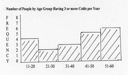
Histogram
The histogram is like a bar graph with intervals. Sometimes we can get a
more accurate picture of the data if we group data. In the example below we had
many different ages, way too many to make a bar for each. By grouping the ages
to 10 year intervals, it is much easier to see the change in frequency as age
increases.
Bar Graph
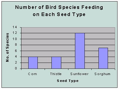
We use a bar graph when we want to compare 2 - 4 groups.
Example:
top of page
Working with
Percentages
Calculating Percentages
A percentage is a part of the whole. To calculate:
Percentage = Part/whole x 100 (number/total x 100)
Example: 12 students
of a class of 25 are male
Percentage of males = 12/25 x 100 = 48%
Displaying Data in a Percent Table
Example:
% of Animals Eaten by a Fox
|
Prey |
Number Eaten |
Percentage of Diet |
|
Rabbits |
3 |
7.5% |
|
Birds |
6 |
15% |
|
Mice |
27 |
67.5% |
|
Rats |
4 |
10% |
|
|
|
|
|
Total |
40 |
100% |
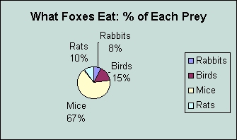
Making a Circle Graph (Pie Chart)
Steps to Making a Circle Chart:
1. Calculating the Angles for Each "Pie Slice": The difficult part of making a circle chart is to convert each percentage of the whole to the degrees of angle that the "pie slice" will be of the circle. To do this, you multiply the percentage times 360o.
Example: (Using the data table above) 15% rabbits
Step 1: Convert percent to decimal 15% divided by 100 = 0.15
Step 2: Find degrees of angle of "pie slice" 0.15 x 360o =
54o
Step 3: Repeat for all percentages.
Step 4: Check accuracy of math by seeing if all angles add to 360o.
2. Constructing the Circle Graph
Step 1: Draw a circle, and mark the center.
Step 2: Draw a radius.
Step 3: Use protractor to mark the angle for the first "pie slice".
Step 4: Repeat for each angle.
Step 5: Label each pie slice with identification and percentage.
Step 6: Include title.
Example:
Mean - average
To calculate:
1. Sum all data.
2. Divide by the number of data points.
3. Round off to one decimal place more than what each number
is.
Example: 1, 8, 3, 7, 2, 4, 6,
5 Sum =
36 # of data points = 8
Mean = 36/8 = 4.5
Median - middle number
To calculate:
1. Arrange the numbers in order, and count down to the
middle number.
2. If there are an even number of
data points, it will fall between 2 data points; average the two to get the
median.
Mode - most common number
Example: Pendulum frequencies - 25,25,24,25,25,23,25,25,25
"25" is logically the "correct" reading since it appears
most of the time. Report the mode as 25.
Which Do I Use?
Mean - This is OK to use if data are evenly distributed.
Median - This is better to use if you have outliers (numbers that are
much higher or lower than the other numbers) because the outliers would
significantly raise or lower the mean. Use this number if you are doing a
Box and Whisker Plot.
Mode - This is best to use if one number seems to be easily the most
commonly appearing number; this would lead to the conclusion that it is the
"correct number".
Comparing 2 Variables
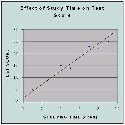
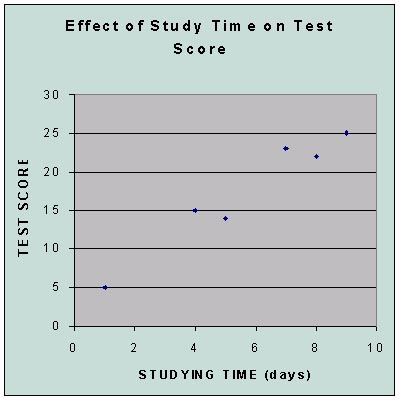
Scatter Plot
EXAMPLE:
Line of Best Fit
The points in the scatter plot above look like they loosely form a line.
We can draw a line which roughly intersects these points. We can then use
a value (correlation) to find how close the points are to the line and find a
formula for the line.
